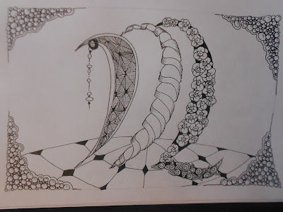
Getting ready to start a new adventure: The Adventure of the Traveling Tiles. It's going to be fun!
So far, I've swapped three tiles, and I've gotten two fun mail packages, from Pam Signorelli and Michele Wynne.
From Pam. Look at the black! and the white one with the square string has little birds touching beaks in the corners. That one reminded me right away of Mayan or Russian folk art, and I tried to follow thru with that theme. Not sure how well I did, though I found some pretty cool Mayan designs
at any rate, this is what I made of them:
She started me with garlic in a corner and I added hollibaugh, pokeleaf, and tipples. Finding the way to shade it was fun. I ended up using white charcoal pencil, but leaving the "shaded" areas on hollibaugh and pokeleaf...I think it worked!
This one was lots of fun. It was like drawing my own coloring page and then coloring it in! I added opus in the alternating corners, and then in the center I tried to follow a Mayan pattern I found. I may deconstruct that a bit, because it could be way cool. Anyway, I was looking at a Mayan design when I started it....
Then some Hi-C corners. To color it, I was going with primaries, but then wanted purple in the border.
You can see two pretty gnarly smudges, where I bled on my art hahaha after biting a hangnail right before picking up my pen to start. Argh!
This one to the left has the most interesting texture, and an absolutely luscious color palette. Yum! Starting with a corner full of tripoli...mmm, mmm, good!
I added D-vine, ribbonz, and flord.
With a little bit of tipple, and some flower petal looking things.
And used my gray tombow for shading here and there.
Which I haven't done that often.

This one has THE most amazing detail, with a delightful shading around the sand swirl, making it all turquoise-y.
Another terrific color palette.
to keep true to Michele's work, I used green and blue micron pen, and highlighted a lot with white charcoal, and used some sand swirl around my Niuroda and printemps. I would LOVE to know how Michele got her shading so smooth in her sand swirls. I burnished like mad with the burnishing pencil by Prismacolor. A mooka up there in the left was fun. One of the things I enjoyed the most in this was working around the little spots of pure white. I left them untouched in my sandswirls, but in the mooka I went ahead and tangled through it...maybe a bit like a beam of light? Some onomato. Oh...nearly forgot, I made a row of shnek on top of Michele's row of perfs, and tried to do gemstones in the shneck rounds.
And with that, now on to Joey's challenge for this week.
She started us with a corner of one of my VERY favorite grid tangles...buttercup.
 and this is what I made of it:
 | |||||
| Shakin the Blossoms Down |
The zen seems to be back, and I'm feeling inspired and energetic. I made a bunch of tiles from a piece of tiepolo paper I bought from DaVinci art supply online, and am enjoying very much stringing them and tangling.
Three I have finished for 3x3 ensemble piece.
And eager to do some more.


 the tangle is Villers #2
 this was berry juice, too. And I was scared of color, didn't know what to do with it, so I did this funky alien cave thing. ha! It was fun then, and it is fun now.