It's a pattern I want to tangle with more. Haven't gotten it out in a long time, and it really is cool looking.
Because I fell in love with Crazy Huggins this past week, I wanted to use it, too. So I made an amphora frame, and filled it with CH.

So, that one still needs work. But I fetched a colored tile out of my stock, and did this:
After making that amphora sea slug across the middle the colors themselves cried out for Aura Lea, so I complied. A few highlights in white charcoal pencil, and shading with various Faber Castell and Prismacolor pencils, and I think it turned out okay. It is vaguely Under the Sea-ish, which I've seen some of, from other artists in this challenge.
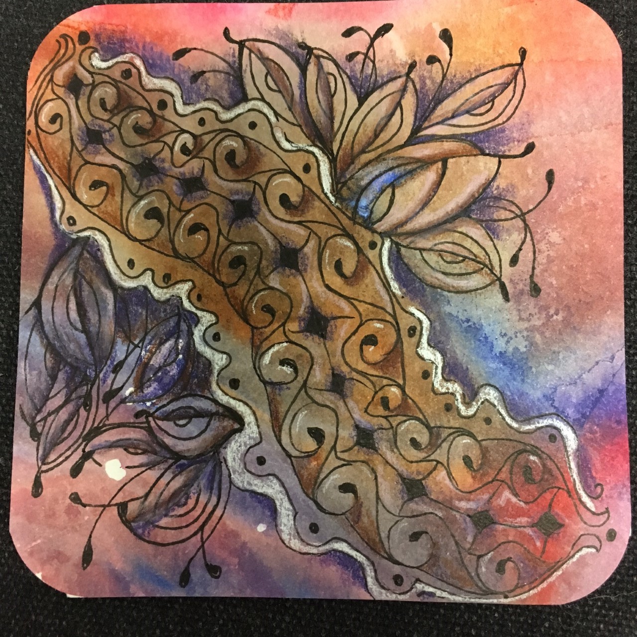
Now, on to Joey's challenge this week: The Letter J and the tangle Jelly roll

Jelly Rolls on the bottom with a few Jetties, and Jilli all in the background. I filled in the j string with white charcoal pencil, and outlined it in white gelly roll pen. Jilli looks pretty cool overlaying all that color. I shaded with prisma and Faber Castell.
I do like the Faber Castell pencils. they have a creamier feel, and blend with each other SO nicely. they're oil based, whereas the Prisma's are wax based, and they cost about twice as much as Prismacolor, but their quality is superb. I bought all the "rainbow" colors, plus one brown and one gray. I'll be adding to this a few pencils at a time. They really are nice.
Some sketchbook play:

Another tile from Kate Ahrens


She sent this delectable ATC in butterscotch, with Tropicana crossing it. I finished it with my own Concert beaming up from behind. Shading with brown Faber Castell, highlights with white gelly roller and white charcoal pencil. It did turn out pretty neat looking, eh?
I'll be working on another tile from Kate today, as I've declared this a Stay At Home Day. It's 1:00 pm and I am in my jammies, watching some Hiyao Miyasaki, and relaxing deeply.
Hello Heidi Sue! I love your especially your colored tile. It creates some magic feeling. The black and white tile with the pattern in pattern is very interesting. Best wishes from Germany! Margarete
ReplyDeleteWonderful works, all of them. The black and white, classic, is really lovely.
ReplyDeleteAll beautiful and great colored paper.
ReplyDeleteVery nice work, especially the coloured ones. Thanks for the information. There is a big different in colourpencils and I'm glad with every information. Prismacolours is difficult to buy in Europe, but maybe I will try the Faber Castell!
ReplyDeleteThe coloured Amphora and the traveling tile with Kate are my favorites this week.
I think you knocked your other tiles off the shelf when you placed the travelling tile last. It is absolutely marvelous. Colors a perfect and the design and the choice of pattern are spectacular (reminded me of utopia). Mind you, I like the other colored ones, too, but the last you should frame.
ReplyDeleteIt's always a pleasure to see your beautiful art! Each tile is unique, lovely, AND wonderful! 😘💕
ReplyDeleteAll your Tiles are wonderful! Amphora works really well as a border. My favourite is definitely the Kate Ahrens tile you complete. The colour is so rich and luminescent! Yes, you need to frame that one!
ReplyDeleteAlways fun to get new pencils! All of your tiles are so well done and a pleasure to look at!
ReplyDelete